Topic 6 Graphics in R (Part-II)
6.1 Interactive Plots using Plotly
- Here we will use the COVID-19 data provided by John Hopkins University
library(ggplot2)
library(maps)
library(ggthemes)
library(plotly)
library(scales)
library(dplyr)
library(tidyr)

# download data
d1 = read.csv("https://raw.githubusercontent.com/CSSEGISandData/COVID-19/master/csse_covid_19_data/csse_covid_19_time_series/time_series_covid19_confirmed_global.csv",
    check.names = FALSE)
# head(d1)- Data is in wide format let’s convert in long format for visualisation
# rename Provice/State and Country columns
colnames(d1)[1:2] = c("State", "Country")

d1.2 = pivot_longer(d1, cols = -c(State, Country, Lat, Long), names_to = "Date",
    values_to = "Cases")
# convert dates

d1.2$Date = as.Date(d1.2$Date, format = "%m/%e/%y")- Aggregate cases by day (dropping the state)
d2 = aggregate(d1.2$Cases, by = list(Lat = d1.2$Lat, Long = d1.2$Long, Country = d1.2$Country,
    Date = d1.2$Date), FUN = sum)
colnames(d2)[5] = "Cases"
# reorder
d2 = d2[, c(4, 1, 2, 3, 5)]- Let’s find top 10 by case numbers
- Using aggregate to find sum by country to find top 10
top1 = aggregate(d2$Cases, by = list(Date = d2$Date, Country = d2$Country), FUN = sum)
# select the last date to get overall total
top10 = top1[top1$Date == "2021-08-11", ]
# select top 10
top10 = top10[order(-top10$x), ][1:10, ]
# let's include Aus
top10_country = c(top10$Country, "Australia")- Use ggplot to create a line chart 6.1
colnames(top1)[3] = "Cases"
data_p = top1[top1$Country %in% c(as.character(top10_country)), ]

p1 = ggplot(data = data_p, aes(Date, log(Cases), color = Country, group = Country)) +
    geom_line(stat = "identity", size = 1) + scale_x_date(labels = date_format("%m/%y"),
    breaks = "2 months") + theme_wsj()
p1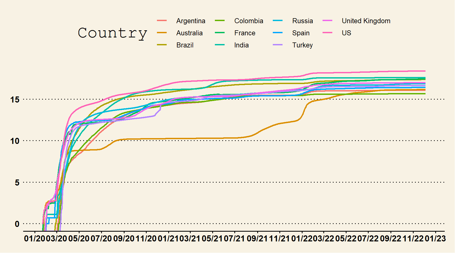
Figure 6.1: Line Chart with Custom Theme
- Create custom color vector and a line chart with basic theme to convert to plotly 6.2
myCol2 = c("slateblue1", "purple3", "turquoise2", "skyblue", "steelblue", "blue2",
    "navyblue", "orange", "tomato", "coral2", "palevioletred", "violetred", "red2",
    "springgreen2", "yellowgreen", "palegreen4", "wheat2", "tan", "tan2", "tan3",
    "brown", "grey70", "grey50", "grey30")

p2 = ggplot(data_p, aes(Date, Cases, group = Country, color = Country)) + geom_line(size = 1.5) +
    geom_point(size = 1.5) + scale_colour_manual(values = myCol2, "Countries") +
    geom_text(data = data_p[data_p$Date == max(data_p$Date), ], aes(x = as.Date(max(data_p$Date) +
        4), label = Country), hjust = -0.01, nudge_y = 0.01, show.legend = FALSE) +
    expand_limits(x = as.Date(c(min(data_p$Date), max(data_p$Date) + 5))) + scale_x_date(breaks = seq(as.Date(min(data_p$Date)),
    as.Date(max(data_p$Date) + 5), by = "30 days"), date_labels = "%m/%y") + scale_y_continuous(labels = comma) +
    theme_classic() + theme(axis.title = element_text(size = 15, face = "bold"))
p2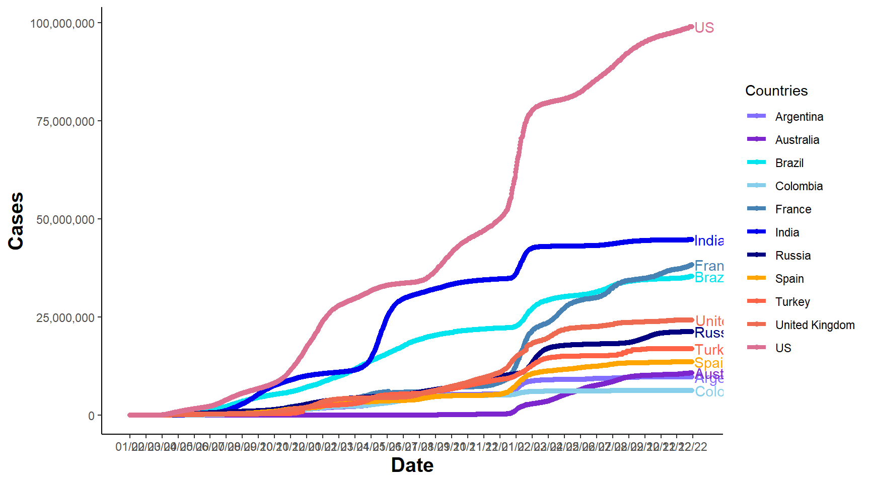
Figure 6.2: Line Chart
- Convert to plotly for interactive graphics 6.3
fig_p2 = ggplotly(p2)
fig_p2
Figure 6.3: Interactive Line Chart
6.2 Animation using gganimate
- We can also use the gganimate package to convert the image into a gif.
library(gganimate)
p1.anim = p1 + transition_reveal(Date)
anim_p1 = animate(p1.anim, fps = 10, start_pause = 2, end_pause = 5, rewind = FALSE,
    width = 800, height = 1000)
anim_save(filename = "covid_cases_log_2021aug.gif", animation = anim_p1)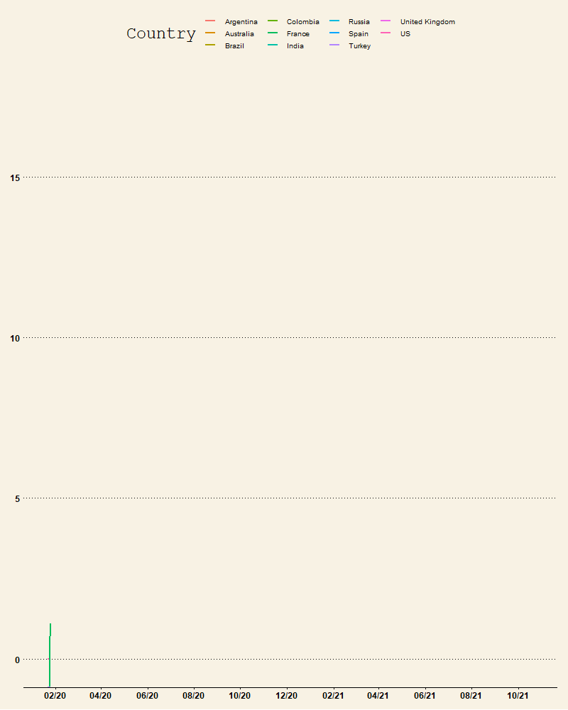
Figure 6.4: Animated Graph
- We can also use further customisations to visualise other information on the plot
- The following example uses data from the 2021 COVID-19 spread in Australia
- The plot shows the number of Covid-19 cases along with the Date in the animation
- The data is the last 3 months data (accessed: 30-08-2021), downloaded from https://www.covid19data.com.au/states-and-territories
- The code below imports the data and selects NSW, VIC and ACT, then creates EMA and SMA using last 7 Days of data.
library(tidyverse)  #using tidyverse here to easily create grouped statistics
d_au_3m = read.csv("data/Last 3 months.csv")
# the date column name doesnt look ok so lets rename it
colnames(d_au_3m)[1] = "Date"
# convert to date type
d_au_3m$Date = as.Date(d_au_3m$Date, format = "%d/%m/%y")
d_au_3m = d_au_3m[, c(1:3, 9)]
data_p2 = d_au_3m %>%
    pivot_longer(cols = -Date, names_to = "State", values_to = "Cases")
rolling1 = data_p2 %>%
    arrange(Date, State, Cases) %>%
    group_by(State) %>%
    mutate(EMA = TTR::EMA(Cases, n = 7))  #add EMA
rolling1 = rolling1 %>%
    arrange(Date, State, Cases) %>%
    group_by(State) %>%
    mutate(SMA = TTR::SMA(Cases, n = 7))  #add SMA
rolling1 = rolling1[rolling1$Date > as.Date("2021-07-15"), ]  #selecting from 15 July 2021
rolling1$State = factor(rolling1$State, levels = c("NSW", "VIC", "ACT"))- Create plots then animate
- Plot
- The plot first layer has points and lines for the EMA (can replace for SMA or plot both)
- The line has an arrow at the end
- The scale is changed to display the dates better and some changes are made to theme elements
- Animation
- A transition_manual is used to access current_frame, cumulative=TRUE keeps the previous data
- Title used elements from the ggtext to modify the colors of the group variables
- Notice the use of element_markdown() in the ggplot
library(ggthemes)
library(ggtext)
p2 = ggplot(rolling1, aes(Date, Cases)) + geom_point(alpha = 0.7, aes(color = State,
    group = seq_along(Date), frame = Cases)) + geom_path(aes(y = EMA, color = State),
    arrow = arrow(ends = "last", type = "closed", length = unit(0.05, "inches")),
    size = 1.05, show.legend = FALSE)
p3 = p2 + scale_x_date(breaks = c(seq(min(rolling1$Date), max(rolling1$Date), by = "5 days")),
    date_labels = "%d/%m") + scale_color_discrete(name = "") + labs(x = "Date", y = "Cases") +
    theme_minimal() + theme(title = element_text(face = "bold"), legend.position = "none",
    axis.title = element_text(size = 8), strip.text.x = element_text(face = "bold"),
    axis.text.x = element_text(size = 5, face = "bold"), axis.text.y = element_text(size = 6,
        face = "bold"), legend.title = element_text(size = 10), plot.subtitle = element_markdown()) +
    labs(x = "Date", y = "Cases/EMA (7 Day)")

p2.anim = p3 + transition_manual(Date, cumulative = TRUE) + ggtitle("NSW, VIC & ACT Daily Cases/EMA(7 Days) ",
    subtitle = "Date:{current_frame}<br><span style='color:#F8766D;'>NSW:{rolling1[rolling1$Date==as.Date(current_frame),3][2,1]} </span> | <span style='color:#00BA38;'>VIC:{rolling1[rolling1$Date==as.Date(current_frame),3][3,1]}</span> | <span style='color:#619CFF;'> ACT:{rolling1[rolling1$Date==as.Date(current_frame),3][1,1]}</span>")

anim_p2 = animate(p2.anim, fps = 8, start_pause = 1, end_pause = 30, detail = 2,
    rewind = FALSE, width = 720, height = 720, res = 140, renderer = gifski_renderer())
anim_save(filename = "covid_aus_cases_EMA_aug30_.gif", animation = anim_p2)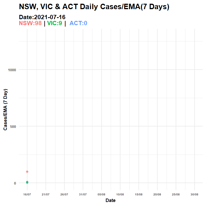
Figure 6.5: Animated Graph (COVID-19 AU)
6.3 Plot Maps
- We can also plot the data on a map 6.6
# take last day's data data from d2
d2 = d2[d2$Date == max(d2$Date), ]
world = map_data("world")
w1 = ggplot() + geom_polygon(data = world, aes(color = region, x = long, y = lat,
    group = group), fill = "white") + theme_map() + theme(legend.position = "none") +
    scale_fill_brewer(palette = "Blues")
map1 = w1 + geom_point(aes(x = Long, y = Lat, size = Cases, colour = Country), data = d2) +
    labs(title = paste("COVID-19 Cases as of ", as.character(unique(d2$Date))))
# static version
map1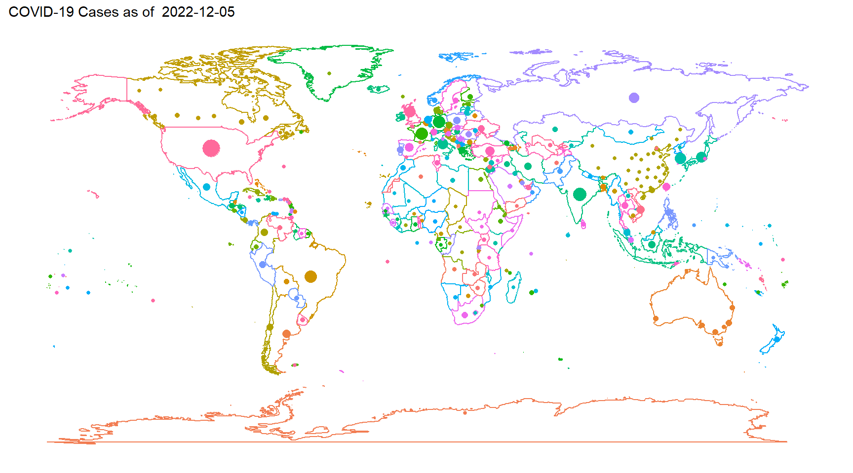
Figure 6.6: Map
- Interactive version using plotly 6.7
# interactive version
map2 = ggplotly(map1, originalData = FALSE, tooltip = c("colour", "size"), width = 750)
map2
Figure 6.7: Interactive Map
# To save htmlwidgets::saveWidget(map2,file='map2.html')